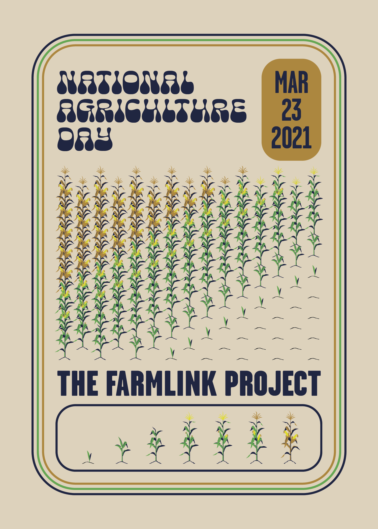

Founded in the early months of the Covid-19 pandemic, the Farmlink Project is a non-profit working to eliminate food waste by relocating farm surplus to food banks and communities in need. Run by over 100 volunteers from across the country, Farmlink aims to bring a fresh and innovative approach to reform an outdated and lacking food distribution system.
Following a recent re-branding of the organization, I have been working with the Design Team on modernizing and expanding our design vocabulary, including a fresh new color palette for Farmlink Project México and for our main media use.
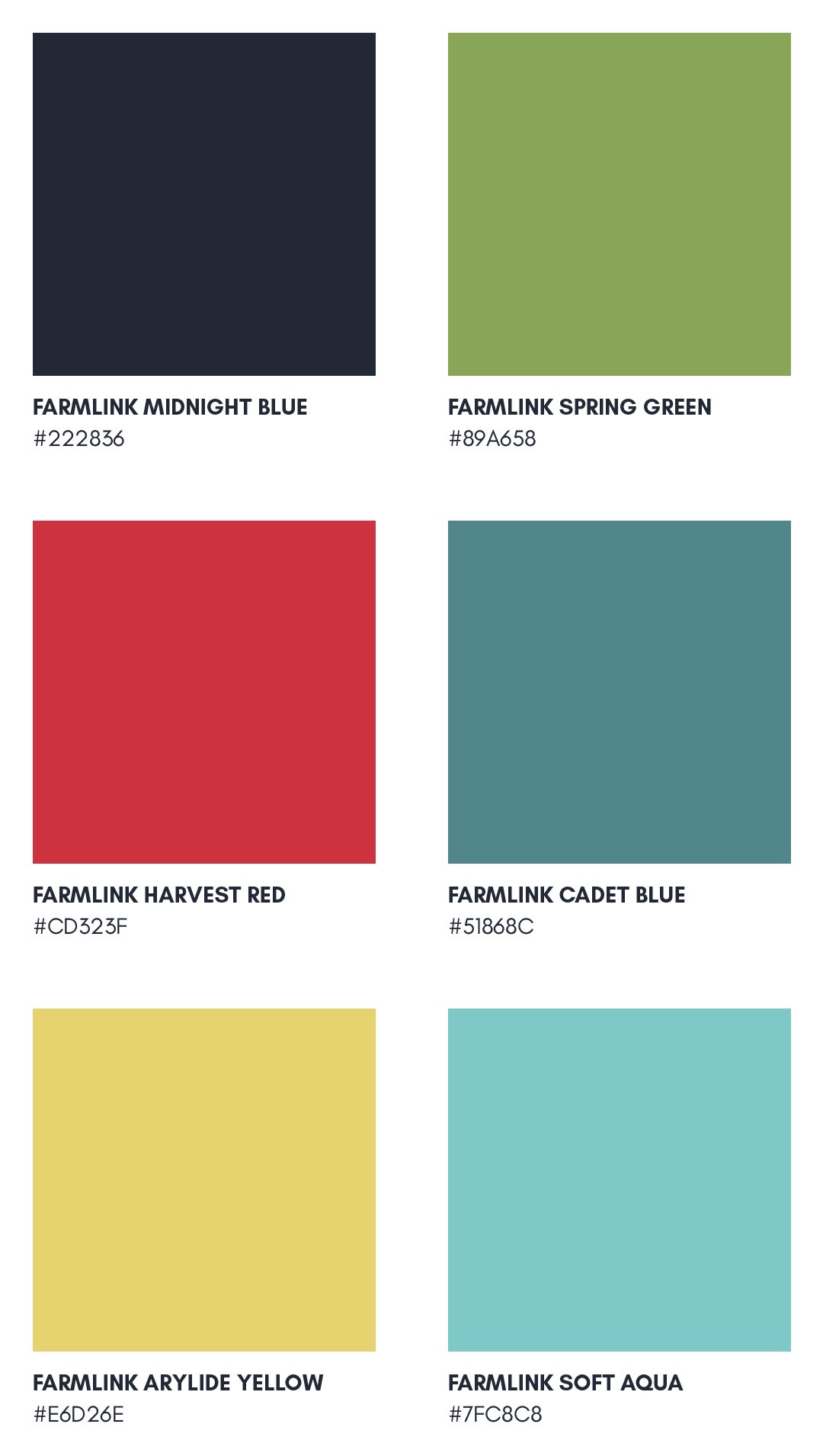
These are the primary Farmlink colors we use in all of our visuals. I added the bottom four to expand our branding vocabulary and allow for more creative graphic elements.
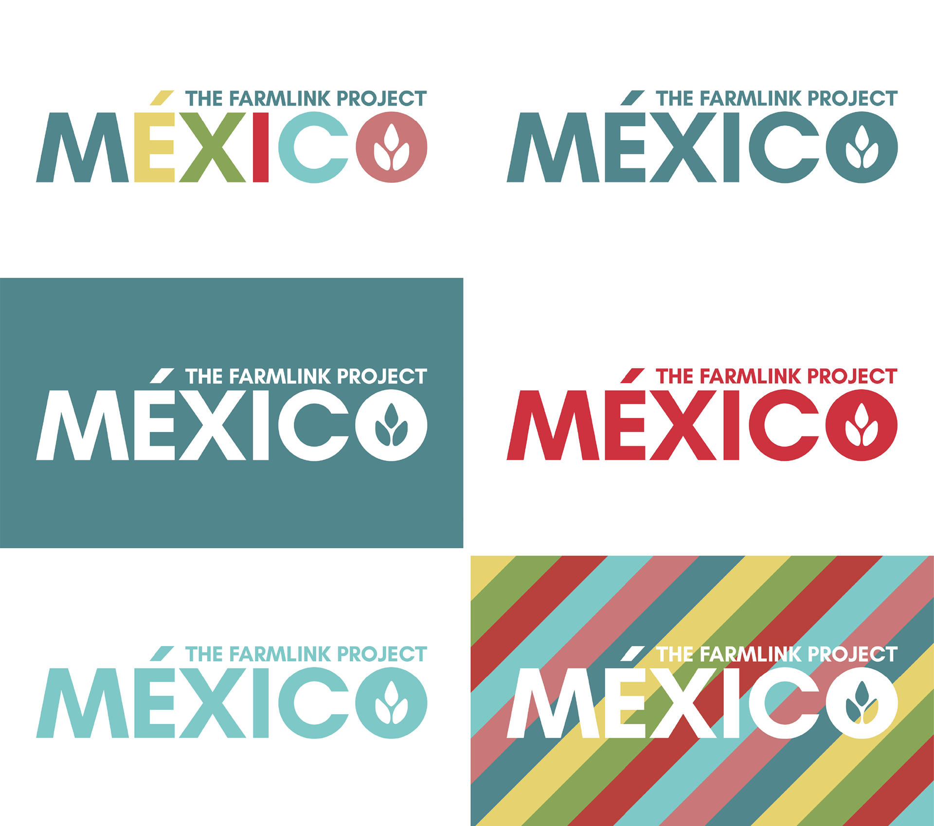
The Farmlink Project Mexico logo I helped create. The additional Farmlink colors were created for this project.
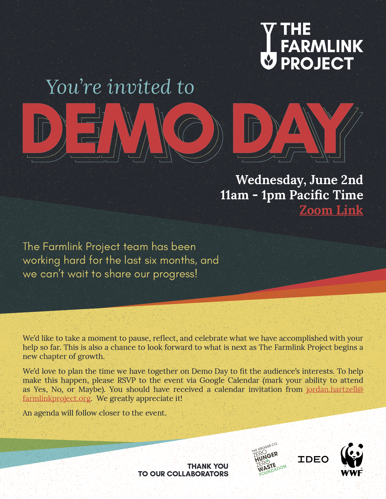
A flyer I designed for our Accelerator team's Demo Day event.
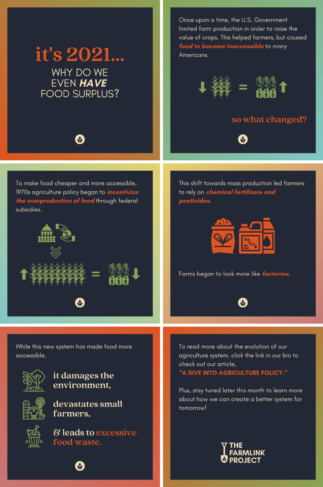
An educational Instagram post I created, describing food surplus in the U.S.
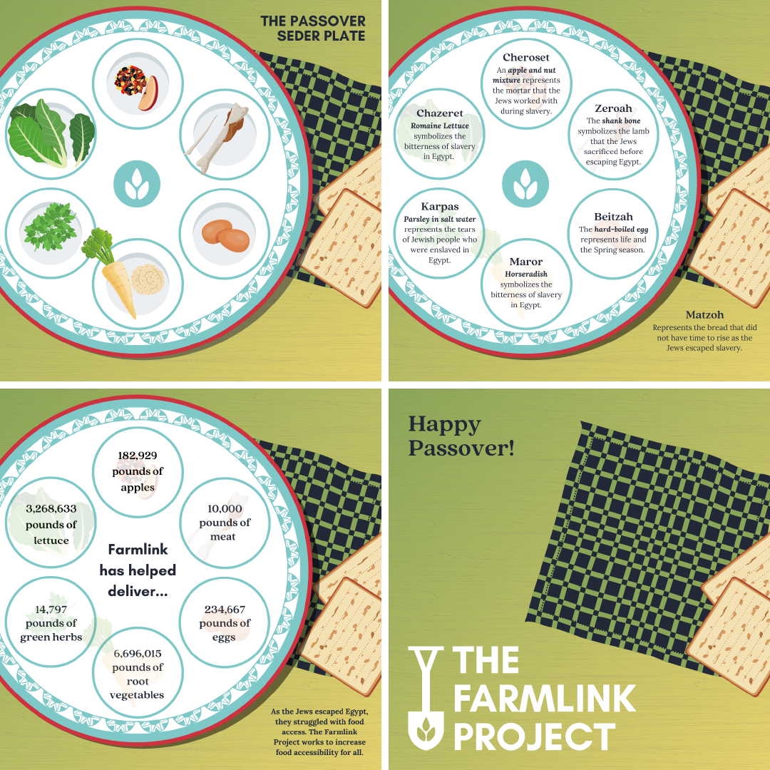
An Instagram post I put together for Passover.
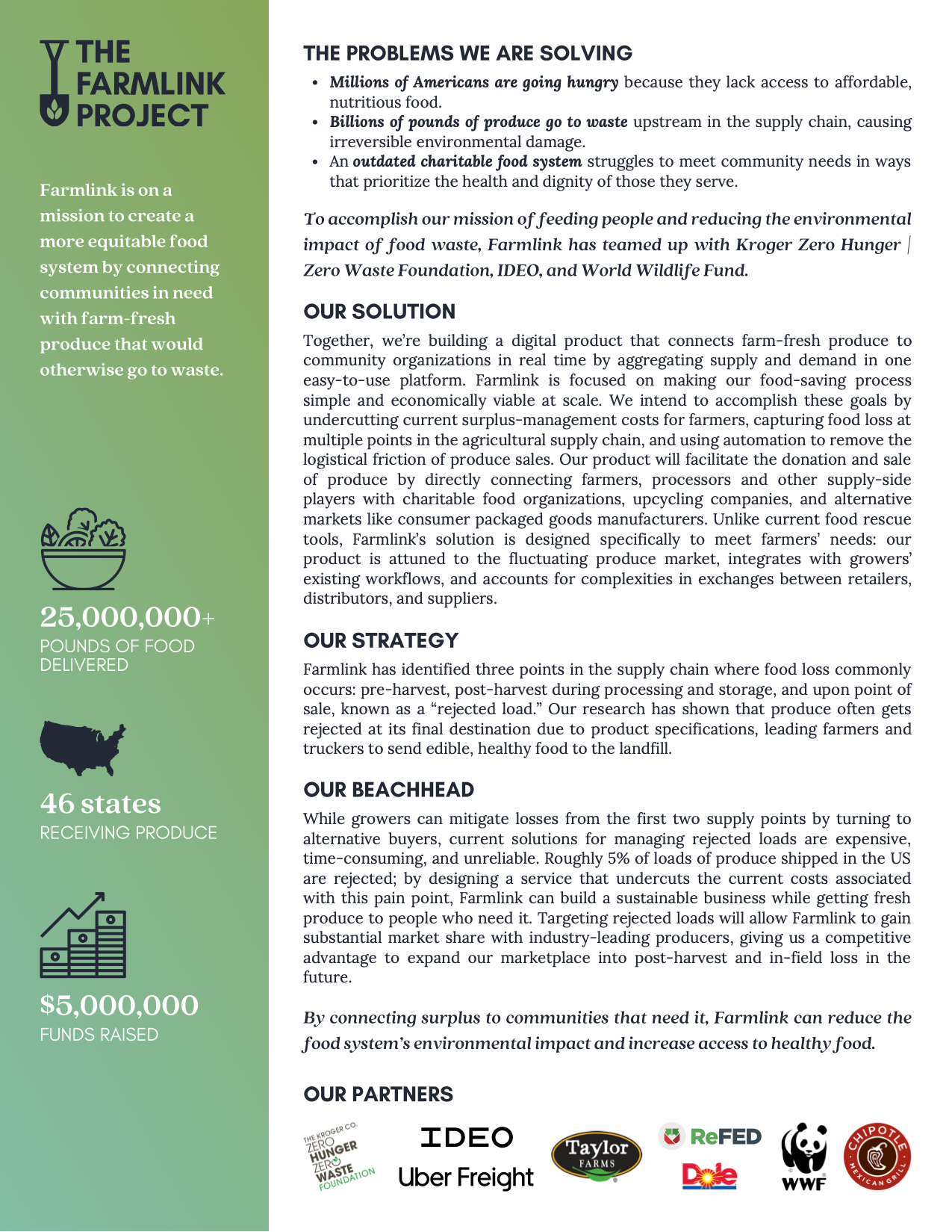
This is an informational one-pager I developed for the Accelerator team.